Every day, millions of links are shared on social media. But what do we gain by sharing others’ content?
Usually, nothing! 😒
So, what if you could attract some of that traffic while sharing their content? It may sound unbelievable, but it’s easy! 😀
By sharing interesting creations from others, you can draw more visitors to your website for free and possibly encourage some to make a purchase.
Sound impossible? Not at all!
In this article, we will reveal the secrets of CTA overlays, guide you through creating them in just minutes, and show you how to use others’ content to drive free traffic to your business!
CTA overlays are call-to-action pop-ups, notifications, or widgets that can boost your growth and build trust.
What is a call to action (CTA)?
A CTA, or call to action, is a key tool for digital marketers.
It encourages users to take the next step, like joining a newsletter, downloading a guide, or making a purchase.
CTAs can appear as phrases, buttons, shapes, popups, ads, texts, or links.
Examples include a “Learn More” button or a “Limited Time Offer – Act Now!” message, all designed to prompt specific actions from the audience. Effective CTAs connect reading a blog post to meaningful engagement.
So, when you see a button saying “Get Started” or a message like “Unlock Exclusive Access,” remember that each effective CTA is crafted to grab your attention and guide you online.
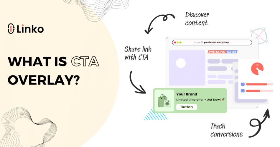
What is a CTA overlay?
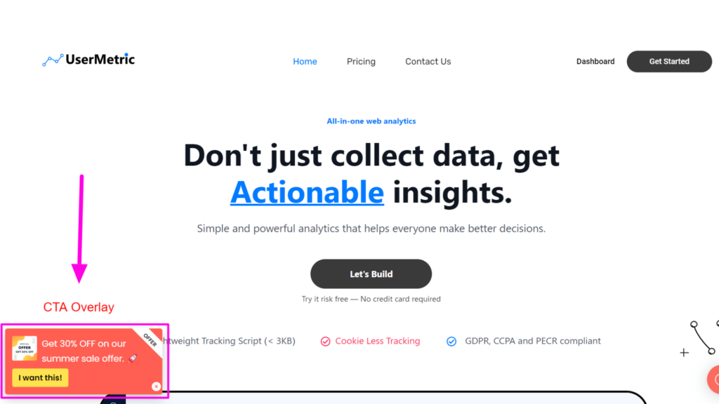
CTA overlays are pop-ups or slide-ins that encourage you to click or subscribe while browsing a webpage.
They’re like bonus rounds in video games: surprising but valuable. However, using them effectively requires more than just a flashy design.
In today’s fast-paced digital world, where attention is crucial, CTA popups can be very effective. They aren’t just for getting clicks; they make those clicks count.
From capturing leads to closing sales, these clever overlays can greatly improve your online presence.
Ready to take your links to the next level?
Maximize your online impact with the powerful Linko URL shortener.
How to create a CTA overlay?
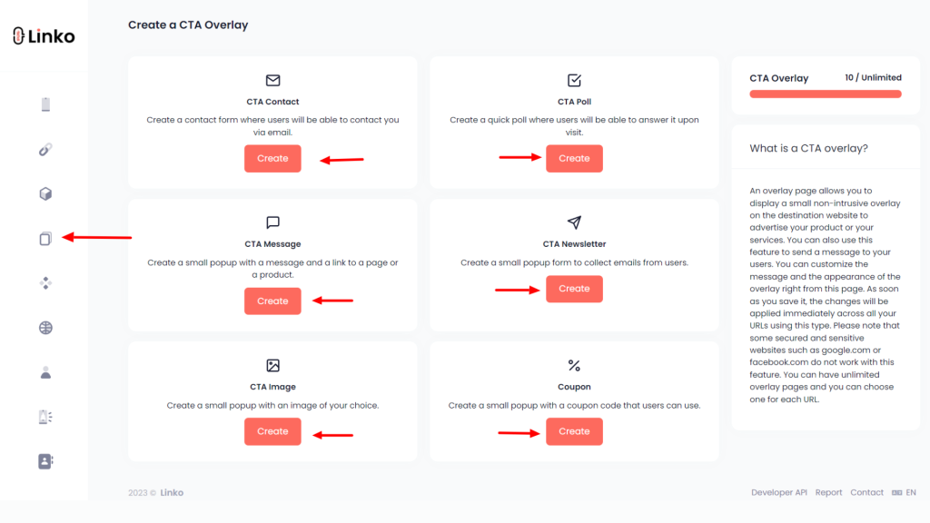
Linko offers 6 different CTA overlays, unlike some other link shorteners that may provide various options.
- Newsletter
- Message & Link
- Coupon
- Contact
- Image
- Poll
Before we detail each one, please create a free account at Linko and follow the steps below.
Step 1: Login to your account.
Step 2: Navigate to the sidebar in your dashboard.
Step 3: Scroll down and hover over the CTA Overlay and Custom Splah icon.
Step 4: Select the CTA overlay.
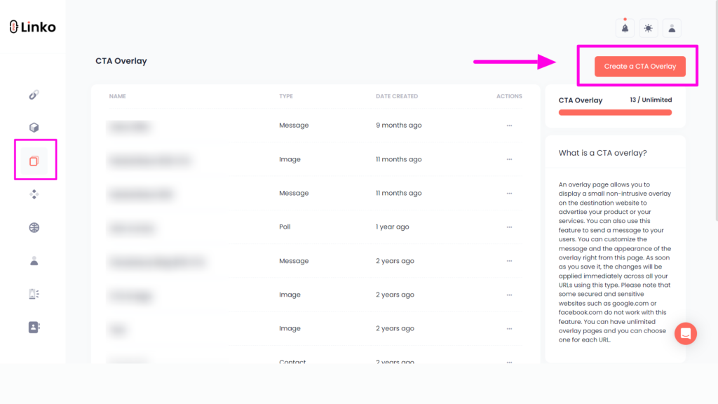
Step 5: Then, click on the “Create a CTA Overlay” button.
Once you have clicked on the create button, you will see 6 different overlay pop-ups.
How to create a CTA link?
A CTA link is a clickable element in text or images that prompts users to take action, like visiting a website, downloading something, or buying a product.
You can customize the popup by adding text, a description, a banner, and a link.
You can take a look at the example here: CTA Link
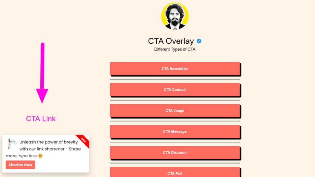
The CTA message and CTA link are the same, so you can use the CTA message as a CTA link.
Follow the steps below to create a link popup:
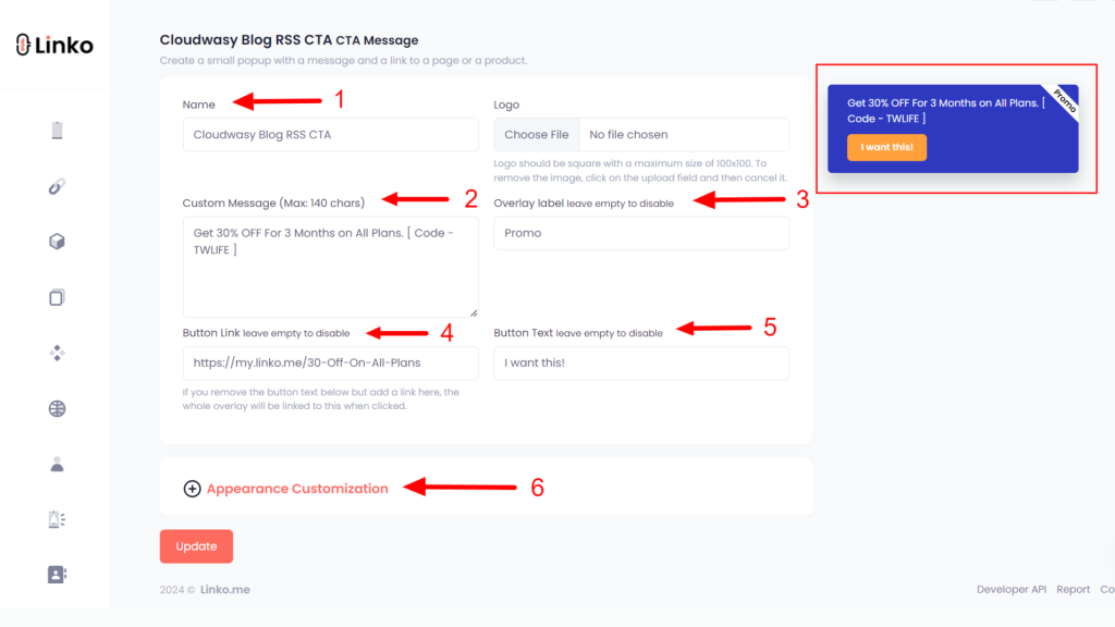
Step 1: Give your CTA a name.
- This name will be only for your reference, and your visitors will not see it.
Step 2: (Optional) upload your logo or image.
- We recommend that the logo should be square with a maximum size of 100×100; otherwise, it will distort.
- To remove the image, click on the upload field, and then cancel it and update the page.
- The image file name should not have a space in it. It should be like this (e.g. custom-image-name.png).
Step 3: Write down your custom message.
- The message should be at most 140 characters long; otherwise, it will not fit the pop-up.
Step 4: Write something for your overlay label.
- Leave it empty to disable it.
- It should be 5 to 7 characters long.
Step 5: Enter your destination link for the CTA.
Step 6: Enter your call to action text for the button.
Step 7: Customize the appearance of your CTA.
- You can customize the appearance of your CTA overlay by choosing different colors for each component.
Step 8: Choose the overlay position.
- Choose whether your popup should appear on the bottom left and right or on the top left and right.
Step 9: Click on the create button.
How to create a CTA message?
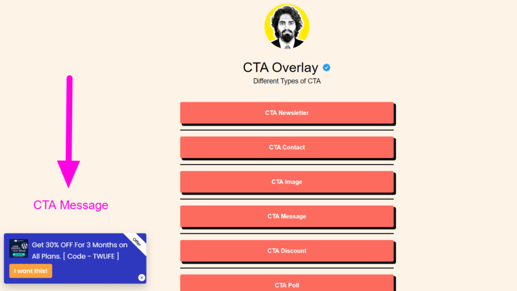
A CTA message is a persuasive description or prompt overlay that calls on users to interact with content, like a small pop-up with a message and a link to a product page or a specific action.
Similarly, you can customize the CTA message to match your branding or campaigns and embed it on the destination website.
You can take a look at the example here: CTA Message
Follow the steps below to create a message popup:
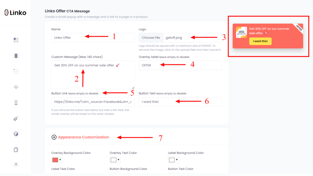
Step 1: Give your CTA a name.
- This name will be only for your reference, and your visitors will not see it.
Step 2: Upload your logo or image.
- We recommend using a square logo with a maximum size of 100×100 to avoid distortion.
- To remove the image, click on the upload field, and then cancel it.
- The image file name should not contain a space. It should look like this (custom-image-name.png).
Step 3: Write down your custom message.
- The message should not be longer than 140 characters; otherwise, it will not fit into the pop-up.
Step 4: Write something for your overlay label.
- Leave it empty to disable it.
- It should be 5 to 7 characters long.
Step 5: Enter your destination link for the CTA.
Step 6: Enter your call to action text for the button.
Step 7: Customize the appearance of your CTA.
- You can customize the look of your CTA overlay by choosing colors for each part of the overlay.
Step 8: Choose the overlay position.
- Select the position of your popup window: bottom left and right or top left and right.
Step 9: Click on the Create button.
How to create a CTA contact?
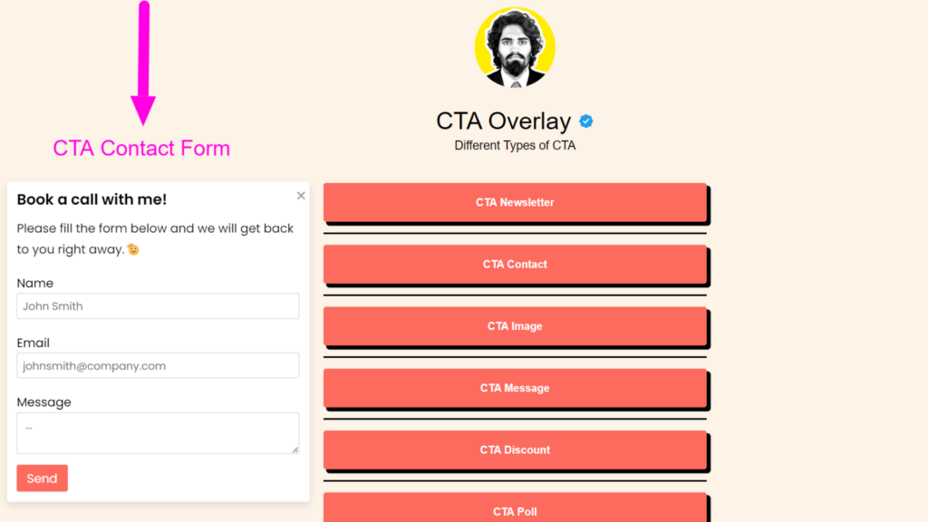
A CTA contact is a clickable contact form popup like a live chat popup where users will be able to contact you via email, promoting direct communication and engagement.
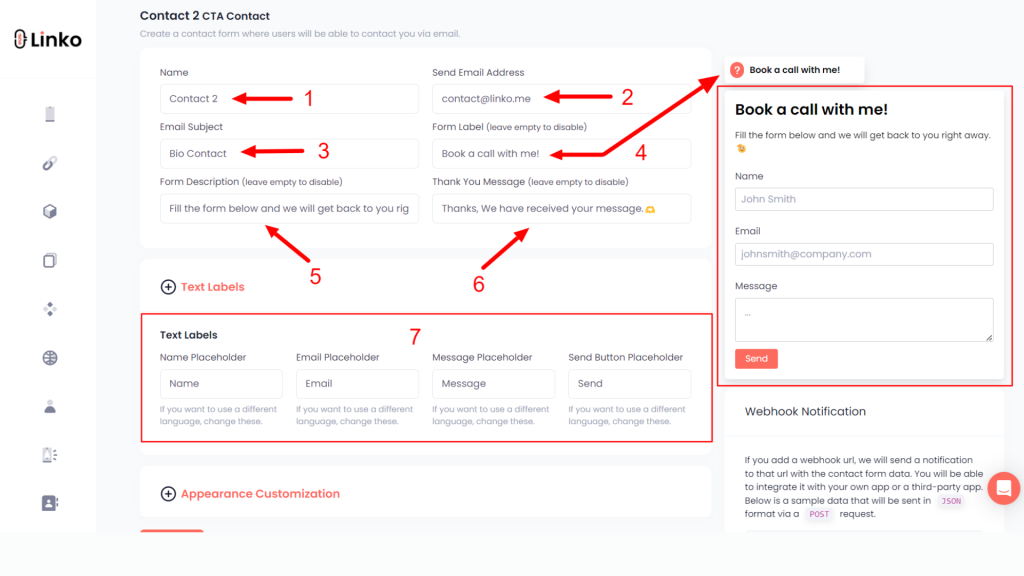
At Linko’s CTA Contact, you can create a full contact form that includes fields for users to enter their name, email, and message.
In addition, you will be able to define whether you want to receive their message via email or webhook.
You can take a look at the example here: CTA Contact
Follow the steps below to create a contact form popup:
Step 1: Give your CTA a name.
- This name will be only for your reference, and your visitors will not see it.
Step 2: Set up an email address.
- The email that you will write down should be active and reachable, because you will receive the user’s contact messages in that email.
Step 3: Write down your subject line for the contact form.
- The subject line should be something that helps you remember where this message came from.
Step 4: Write something on your form label.
- For example, you can write something like this: “Need help?“, “Get in Touch!“, “Contact us.“
- Leave it empty to disable it.
Step 5: (Optional) Write a short description.
- You can also write a short description in your contact form to let people know why and for what reason they should contact you.
- Leave it empty to disable it.
Step 6: (Optional) Write a thank-you message.
- You can write a custom or receiving message to let people know that you have received the message. For example, “Thank you. We will respond to you ASAP.“
- Leave it empty to disable it.
Step 7: (Optional) Customize the text labels.
- If you are from a non-English country, you can use your own language for text labels for a better understanding of your audience.
- For example, instead of English, you can write in French (e.g. name to nom, send to envoyer).
Step 8: Customize the appearance of your CTA.
- You can personalize the look of your CTA overlay by choosing colors for each component.
Step 9: Choose the overlay position.
- Choose whether your overlay should appear on the bottom left and right or the top left and right.
Step 10: (Optional) Add your webhook notification URL.
- If you want to receive notifications directly to your app, add the url to your app’s handler. When there is a submission, you will receive a notification at that URL as well as an email to the address you specified in the contact form.
Step 10: Click on the Create button.
How to create a CTA poll?
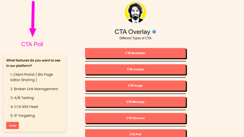
A CTA poll is an interactive overlay with question-and-answer options that invites users to take part in a survey or poll.
It can assist you in gathering insightful feedback while keeping the audience engaged.
As a result, polls can be designed to collect specific information from users, such as preferences, opinions, or demographic data.
It is an effective strategy for engaging audiences and conducting market research, providing businesses with actionable insights to improve their products, services, or content strategies.
You can take a look at the example here: CTA Poll
Follow the steps below to create a poll popup:
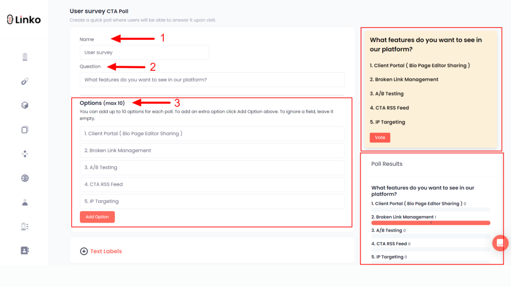
Step 1: Give your CTA a name.
- This name will be only for your reference, and your visitors will not see it.
Step 2: Write down your questions.
Step 3: Provide your answers or options.
- You can add up to 10 options for each poll.
- To add an extra option, click Add Option above.
- To ignore a field, leave it blank.
Step 4: (Optional) Customize the text labels.
- If you are not from an English-speaking country, you can use your native language for text labels to let your users understand better.
- For example, instead of English, you can write in French (e.g. name to nom, send to envoyer).
Step 5: (Optional) Write a thank-you message.
- You can write a custom message to let people know that you have received the message. For example, “Thank you. We will respond to you ASAP.“
- Leave it blank to disable it.
Step 6: Customize the appearance of your CTA.
- You can personalize the look of your CTA overlay by choosing colors for each component.
Step 7: Choose the overlay position.
- Select if you want your overlay to show up on the top left and right or bottom left and right.
Step 8: Click on the Create button.
Where can I find the poll results?
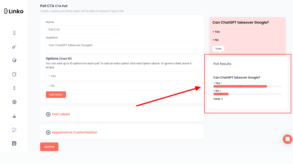
The results of each CTA poll that you created and collected data for will be stored within the same CTA poll.
- Navigate to the CTA overlay.
- Find your poll CTA and click edit.
- Then, you will see a small poll result box under your CTA preview.
How to create a CTA image or banner?
A CTA banner or image is a visually appealing overlay that motivates users to click or engage further.
It typically combines text and graphics to convey a specific message or offer.
Banners can be used to advertise products, announce special events or promotions, highlight key features, or point users to relevant content.
They act as attention-grabbing elements on a website, directing users to desired actions and improving the overall user experience.
You can take a look at the example here: CTA Images
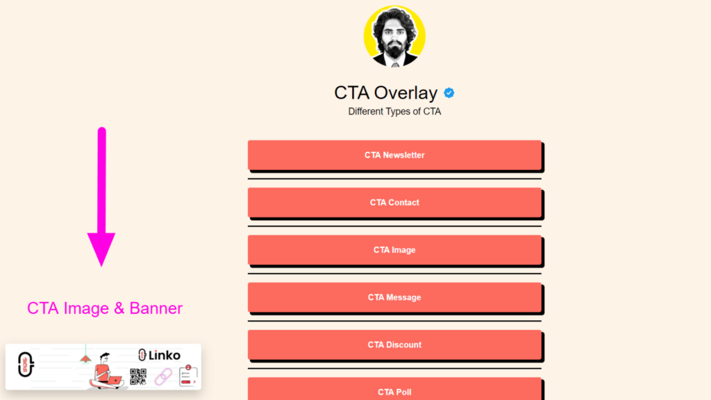
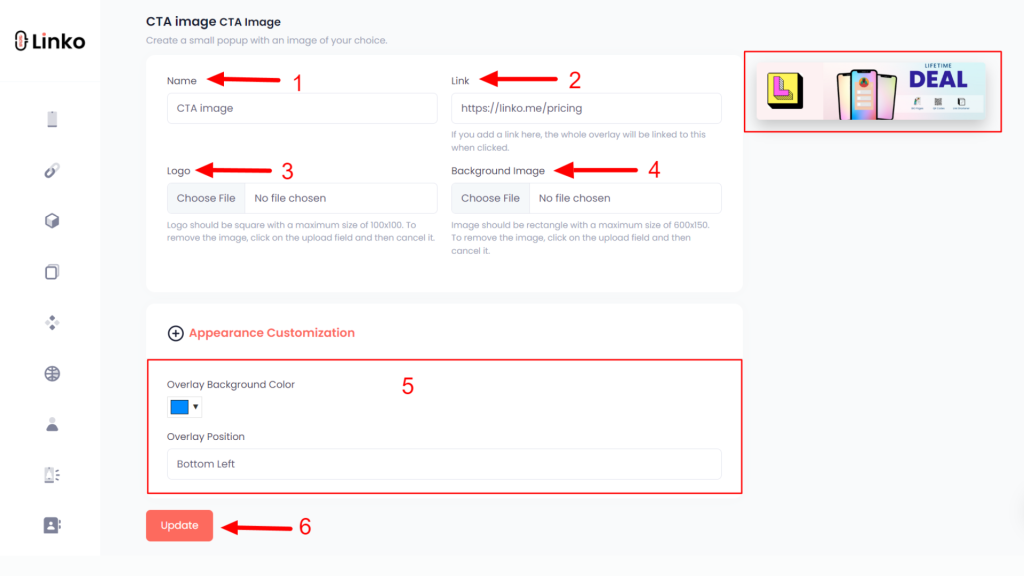
Follow the steps below to create an image popup:
Step 1: Give your CTA a name.
- This name will be only for your reference, and your visitors will not see it.
Step 2: Enter your destination link for the CTA.
- When you add the destination link, the whole overlay will be linked to it when clicked.
Step 3: Upload your logo or image.
- We recommend that the logo be square with a maximum size of 100×100; otherwise, it will distort.
- To remove the image, click on the upload field, and then cancel it.
- The image file name should not have a space in it. It should be like this (e.g. custom-logo-name.png).
Step 4: Upload your background image.
- We recommend that the background image be rectangular and no larger than 600 x 150 pixels to avoid distortion.
- To delete the background image, select the upload field and then select “Cancel.”
- The image file name should not have a space in it. It should be like this (e.g. custom-BG-image-name.png).
Step 5: (Optional) Choose an overlay background color.
- If you do not want to upload a background image, you can simply choose a background color.
Step 6: Choose the overlay position.
- Choose whether your popup should appear on the bottom left and right or on the top left and right.
Step 7: Click on the Create button.
How to create a CTA coupon?
A CTA coupon is a compelling incentive popup that prompts users to take immediate action, such as redeeming a discount code, taking advantage of a special offer, or gaining access to exclusive deals.
Coupons and promotions are powerful marketing assets and strategies that boost sales, increase conversion rates, and foster customer loyalty.
They can be used as pop-ups on websites or as part of marketing campaigns across multiple channels to encourage users to make a purchase or interact with the brand.
You can take a look at the example here: CTA Coupon
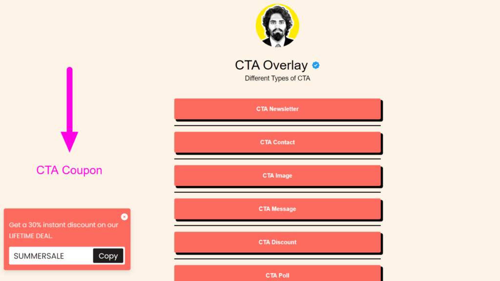
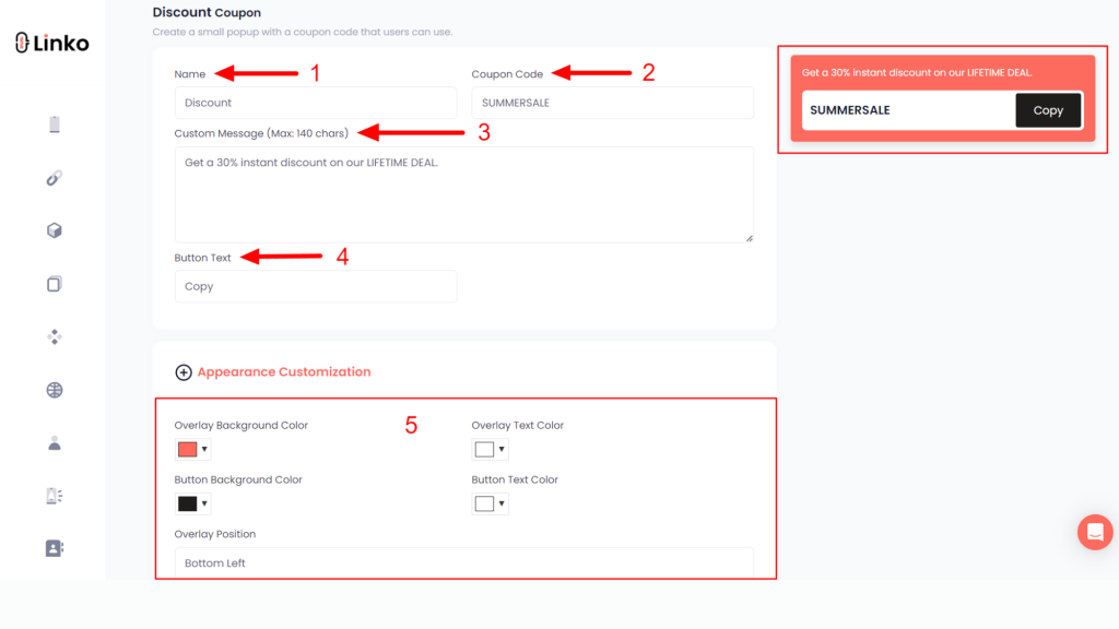
Follow the steps below to create a coupon overlay:
Step 1: Give your CTA a name.
- This name will be only for your reference, and your visitors will not see it.
Step 2: Enter your coupon/discount code.
Step 3: (Optional) Write your custom message.
- The message should not exceed 140 characters; otherwise, it will not fit in the pop-up.
Step 4: Add your text/word for the copy button.
- For example, you can write, Copy.
Step 5: Customize the appearance of your CTA.
- By selecting different colors for each component, you can customize the appearance of your CTA overlay.
Step 6: Choose the overlay position.
- Choose whether your overlay should appear on the bottom left and right or the top left and right.
Step 7: Click on the Create button.
How to create a CTA email collector?
A CTA email collector or newsletter overlay encourages users to sign up for an email list or newsletter.
It’s an effective way to gather leads and emails to expand your subscriber base. Email collectors usually ask for email addresses in return for useful content, special offers, or brand news.
Newsletters help businesses share relevant content, product updates, promotions, and industry news with subscribers, building long-term relationships and boosting engagement.
You can take a look at the example here: CTA Newsletter
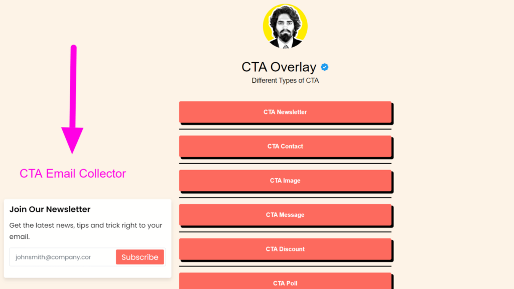
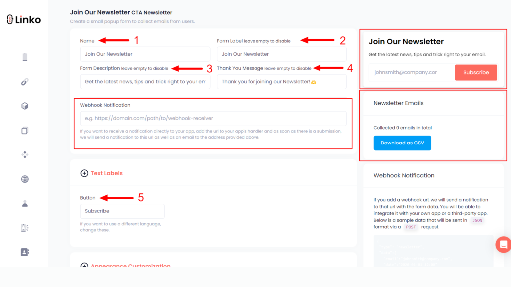
Follow the steps below to create a newsletter popup:
Step 1: Give your CTA a name.
- This name will be only for your reference, and your visitors will not see it.
Step 2: Write something on your form label.
- For example, you can write something like this: “Join our newsletter,” “Get marketing tips to your email.“
- Leave it empty to disable it.
Step 3: (Optional) Write a short description.
- You can also include a brief description on your newsletter overlay to explain why people should sign up for your newsletter.
- Leave it empty to disable it.
Step 4: (Optional) Write a thank-you message.
- You can write a message to people to let them know you received their email and appreciate them signing up to your newsletter, such as “Thank you and welcome to our community.“
- To disable it, leave it empty.
Step 5: (Optional) Customize the text labels.
- If you want to use a different language, you can change the text label.
Step 6: Customize the appearance of your CTA.
- You can personalize the look of your CTA overlay by choosing colors for each component.
Step 7: Choose the overlay position.
- Choose whether your overlay should appear on the bottom left and right or the top left and right.
Step 8: (Optional) Add your webhook notification URL.
- If you want to receive signup notifications via webhook, then add your Zapier or Pabbly Connect notification URL/ endpoint, and when there is a submission, you will receive a notification at that URL.
Step 9: Click on the create button.
How do I get the email addresses of people who sign up via the CTA newsletter?
You can collect the emails in two different ways:
- Either via webhook, as explained in step 8,
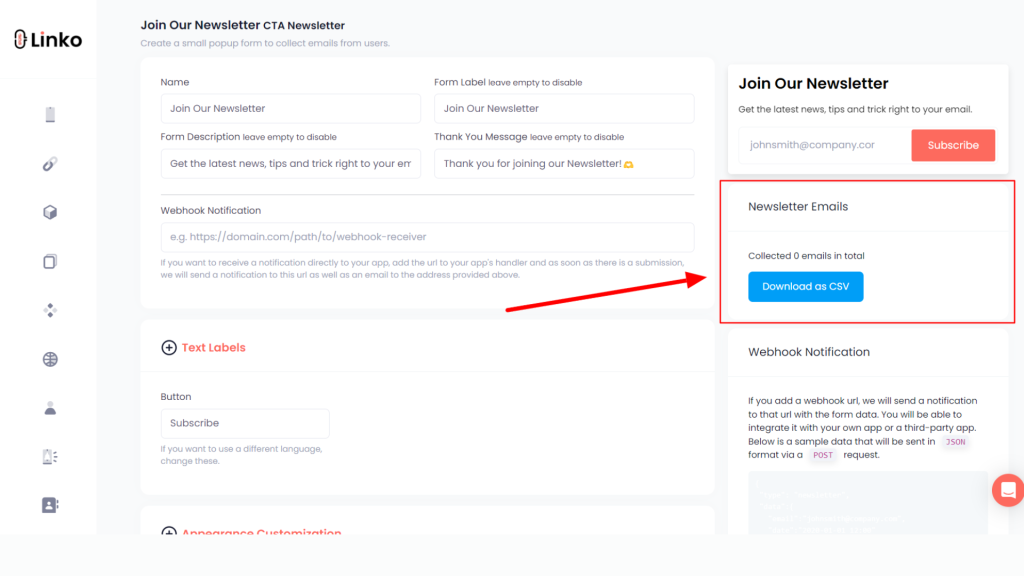
- Or in a CSV file inside the same CTA newsletter that you have created.
Follow the steps below to download your CSV file.
- Go to the CTA overlay section on the dashboard.
- Navigate to the particular newsletter overlay where you want to see your collected data.
- Click on the “Edit” option.
- You will see your collected data on the right side below the overlay preview section.
- Click on the “Download CSV” button.
I have created a CTA overlay, but how do I embed/add it to my short links?
Well done! 🥳
If you have successfully created and designed a CTA overlay, the next step is to assign it to your shortened link.
It is easy to add a CTA to a short link, but there is one thing you should keep in mind first.
Note: CTA overlays do not work on websites that do not support iframe embedding, such as Facebook.com, YouTube.com, Google.com, and so on.
This is because they included the code (X-Frame-Options: DENY) in their site’s configuration to prevent iframe embeds.
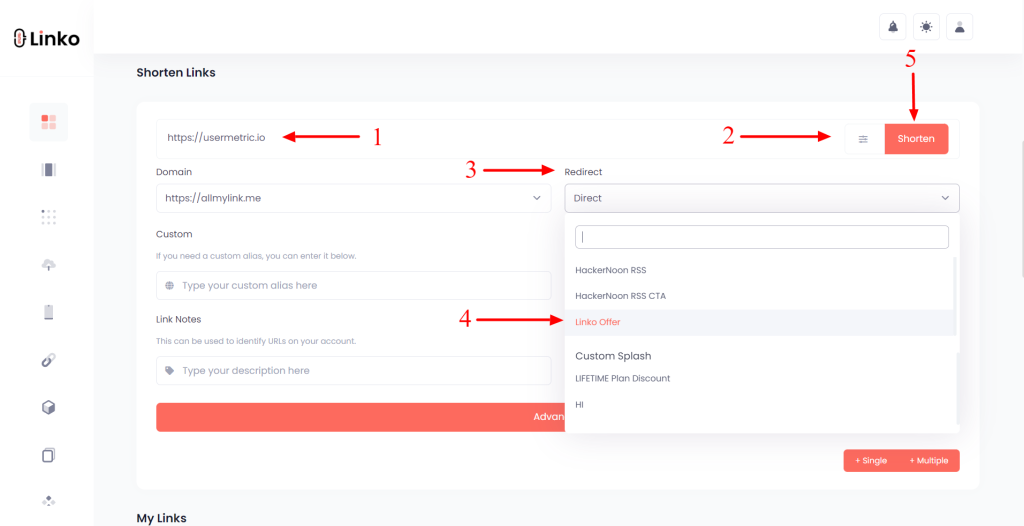
Follow the steps below to add a CTA while shortening the link.
Step 1: Navigate to your dashboard and link shortener section.
Step 2: Paste your destination URL.
Step 3: Click on the advanced settings icon.
Step 4: Click on the redirect drop-down.
Step 5: Scroll down to find your CTA by the name you gave them earlier.
Step 6: Select your CTA.
Step 7: (optional) Select your custom-branded domain.
Step 8: (optional) Add your custom alias.
Step 9: Finally, click on the shorten button.
Follow the steps below to add a CTA to your previously shortened link.
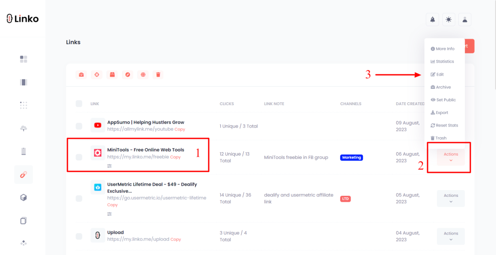
Step 1: Navigate to the My Link section.
Step 2: Find and select the shortened link to which you want to add the CTA.
Step 3: Click on the action icon in front of the link.
Step 4: Click on the edit button.
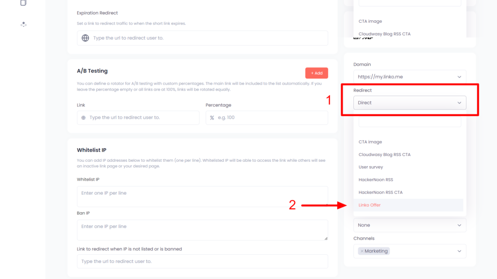
Step 5: Click on the redirect drop-down and find your CTA.
Step 6: Select your CTA.
Step 7: Then, click on the update link button.
What is a CTA RSS Feed or RSS CTA?
A CTA RSS Feed, or RSS CTA, is a useful tool for sharing content. It lets you add calls-to-action to posts or links in the RSS Feed.
Unlike regular RSS feeds that just update content, a CTA RSS Feed includes custom overlays on shared links, boosting user engagement and prompting action.
At Linko, you can create an RSS CTA link that automatically shortens whenever a new post or article is published on the source website, applying the desired CTA overlay.
Bloggers or influencers can use the CTA RSS Feed URL with social media scheduling tools like Buffer or Hootsuite to automate sharing curated content.
This helps maintain a steady flow of engaging posts on their social channels. In summary, a CTA RSS Feed improves content sharing while attracting free traffic from curated content on other websites.
Do you want to create a free Bio Link?
Maximize your online presence with the powerful Linko Bio Page.
Why should we use a CTA overlay?
CTA overlays are essential for increasing engagement and conversions on our website.
These useful pop-ups or notifications capture visitors’ attention and provoke them to take specific actions, such as signing up for a newsletter or making a purchase.
Enhanced Engagement
CTA overlays are like your website’s personal cheerleader🥳, guiding visitors towards the actions you want them to take.
With these attention-grabbing snippets strategically placed throughout your website, you can convert your cold visitors into recurring visitors, which builds trust among your users.
Improved Conversions
CTA overlays can be your MVPs for achieving your goals to get visitors to click, sign up, or make a purchase.
These overlays are shortcuts to the conversion path by making it clear what you want users to do next, allowing you to capture more valuable actions.
Targeted Messaging
Consider CTA overlays your secret weapon for creating personalized messages for different types of marketing campaigns.
Whether you are offering a special deal, announcing a new product, or soliciting feedback, overlays allow you to tailor your message to each campaign’s objectives.
Increased Visibility
In a sea of website content, CTA overlays stand out like beacons💡 in the dark.
Whether they pop up, slide in, or hover on the page, they demand attention, ensuring that your critical messages are seen and acted upon.
Data Collection and Insights
CTA overlays do more than just draw attention; they also collect data.
Tracking interactions, such as clicks and conversions, provides valuable insights into visitor behavior, allowing you to fine-tune your marketing strategy for maximum impact.
Summing Up
CTA overlays are interactive and non-intrusive messages that appear as a layer over website content, with a clear call to action and accompanying text, images, or videos.
And, they could be pop-ups, slide-ins, or inline overlays.
They provide benefits like increased visibility, targeted messaging, promoting FOMO deals, lead generation, and a better user experience.
However, the best practices for effective CTA overlays include action-oriented verbs, compelling value propositions, eye-catching design, strategic placement and timing, and A/B testing.
You can increase conversions and expand your online presence by understanding CTA overlays, designing them strategically, and choosing the right service provider as your business partner.
FAQs
What is a CTA overlay?
A call to action (CTA) overlay lets you place a small, non-intrusive overlay on the destination website to promote your product or service. CTAs can be displayed in different positions and directions, such as a message, banner, text, or coupon, to entice viewers to take action.
What is a CTA?
A CTA stands for call to action. It is a prompt that appears on a website, asking users to take action or directing them to a destination. CTAs can come in different formats, such as text, overlay, popup, slide-ins, or images.
What does CTA mean in writing?
CTAs in writing encourage readers to perform specific actions, such as clicking a link or subscribing to a newsletter. CTAs are used in advertisements, emails, and website copy to engage readers and direct them to specific actions.
Can short links have CTA overlays?
Yes, you can embed or apply a CTA overlay to a short link. But this is only possible using an advanced URL shortener like Linko, Sniply, or Rocketlink.
What is an example of a CTA?
An example of a CTA could be a button on a website that says “Shop Now” or “Sign Up for Our Newsletter.” It encourages users to perform a specific action, such as purchasing or subscribing to updates. CTAs can also appear in email marketing campaigns, where they may prompt recipients to “Learn More” or “Claim Your Discount.” The goal is to persuade users to interact with the content or take a desired action.

Comments