
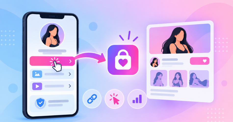
Most advice about creator landing pages contradicts itself, and nobody admits it.
Safety guides tell you to add extra links so the page looks mixed rather than pointing at one adult platform.
Conversion guides tell you that every extra choice costs you subscribers.
Both are right, and you have to pick.
This walks through what actually belongs on the page, in what order, and where those two goals pull against each other.
If you are still deciding whether you need a page at all, that question is answered in direct link vs landing page.
Key Takeaways
- One primary action above the fold does the heavy lifting. Everything else is support.
- Adding links to look safer genuinely costs conversions, so treat it as a deliberate trade rather than free protection.
- Label the main button by what the visitor gets, not by the platform name.
- Use one gate, not two. An age check stacked on a content warning is two chances to leave.
- Build it as a reusable template if you run more than one creator, or you will be styling pages by hand forever.
What Goes on an OnlyFans Landing Page?
Six things, in this order.
The order matters more than the content.
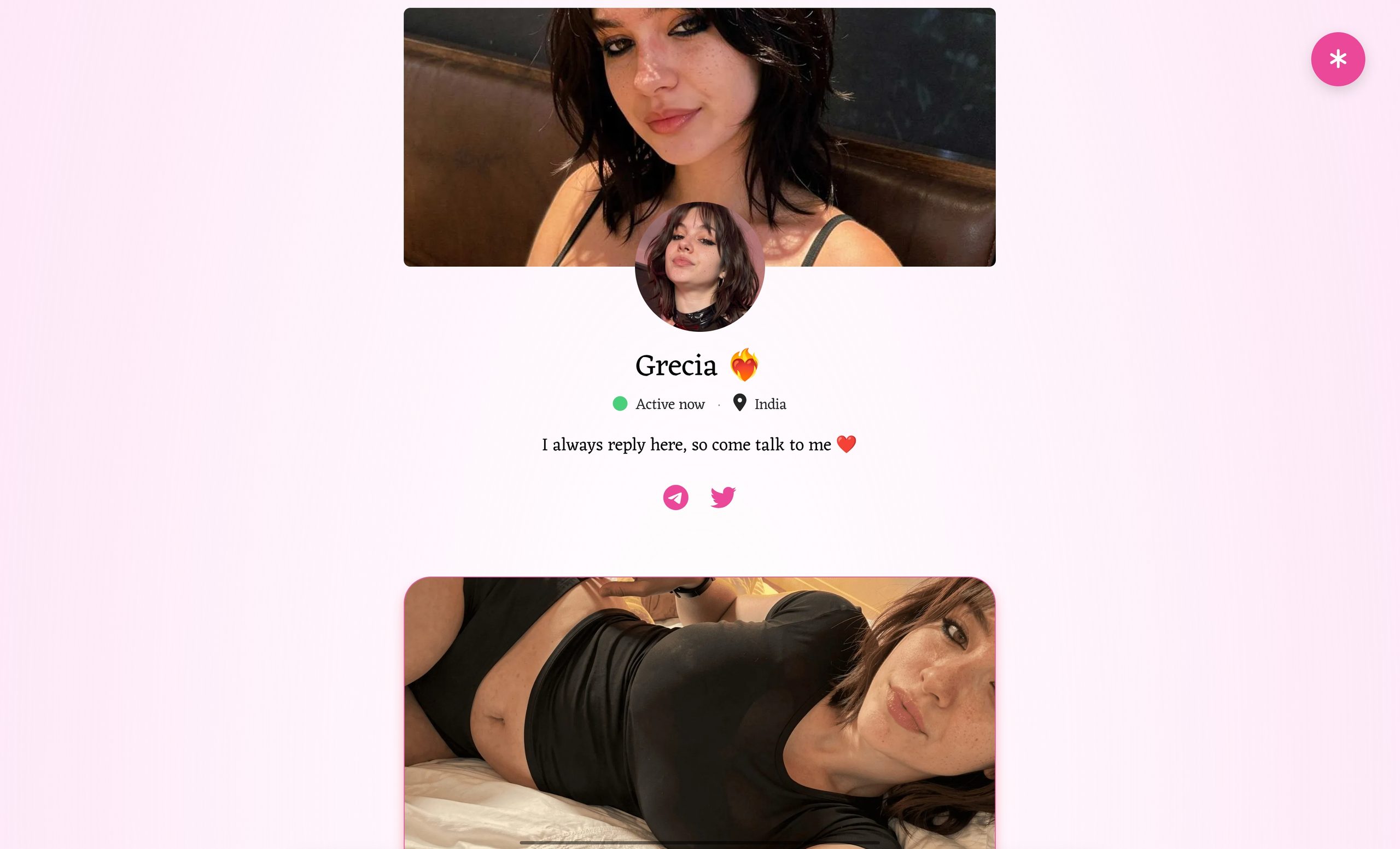
- A photo that matches your social content. Visitors arrive from a specific post and need to recognise you instantly. A mismatch reads as a fake or stolen page, and OnlyFans’ own promotion guidance makes the same point about leading with content that showcases you as a creator.
- One line saying what they get. Not a bio, not a life story. What is behind the button.
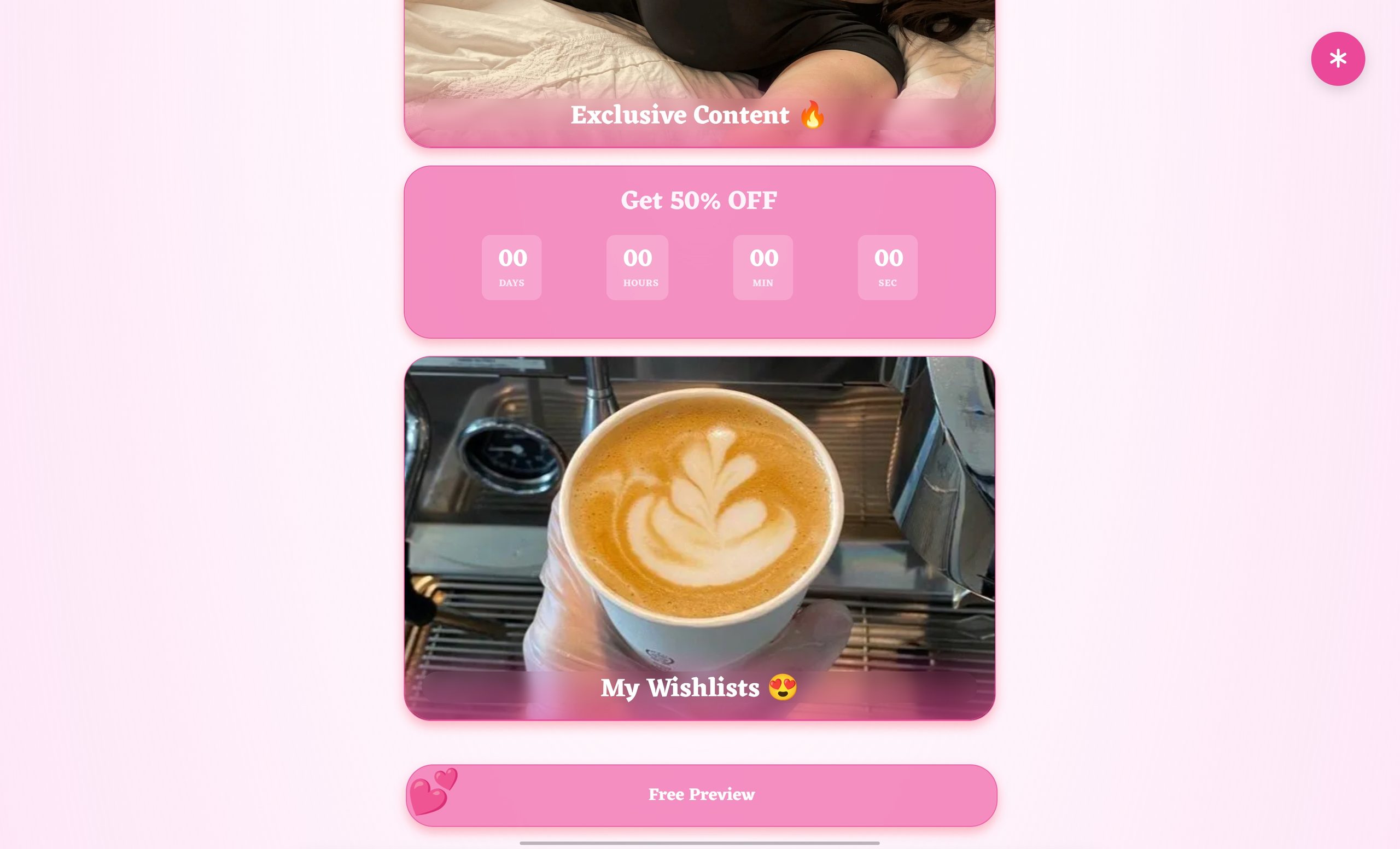
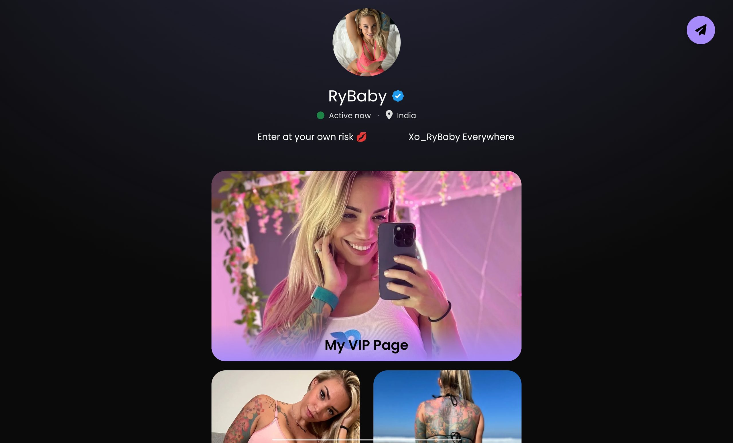
- The primary button, above the fold. Visible without scrolling on a small phone.
- A short proof or preview element. Post counts, a preview image, or a free teaser. Enough to make the paywall feel reasonable.
- Secondary links, below the primary. Free page, socials, tip jar, wishlist. Below, never beside.
- Whatever gate your situation requires. Age confirmation or a content warning, and only one of them.
That is the whole page.
Anything else you add has to earn its place by beating the cost of the extra choice it creates.
How many links should be on it?
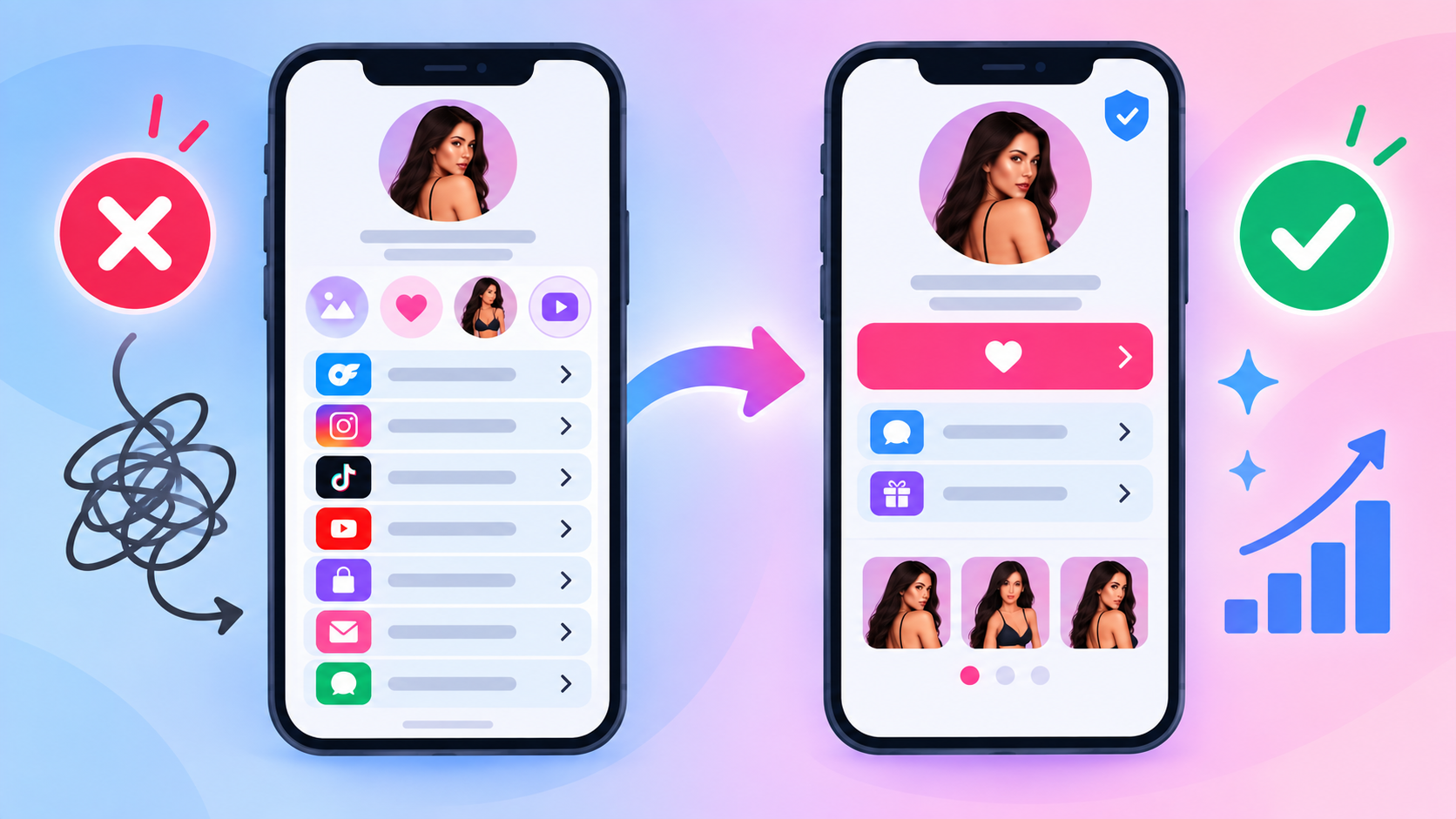
Three to five total, with one clearly dominant.
Past five, the page becomes a menu and the visitor browses instead of subscribing.
The main button should not compete with anything visually.
Same size and colour as the others means it is not primary, whatever order you put it in.
Where Safety Advice and Conversion Advice Collide
This is the part worth reading twice, because it is the decision that changes your revenue.
Circulating advice in creator communities says to add several links to a page so the destination is diluted and the page does not look like a single funnel to an adult platform.
Creators genuinely report being told this after a domain gets flagged.
The problem is that dilution and conversion are the same dial turned in opposite directions.
| Choice | Effect on conversions | Effect on risk |
|---|---|---|
| One button, one destination | Best | Highest, the page reads as a single funnel |
| Three to five links, one dominant | Slightly lower | Moderate |
| Eight or more mixed links | Clearly worse | Lower, but the page becomes a directory |
| Socials only, adult link one step deeper | Worst on the first step | Lowest |
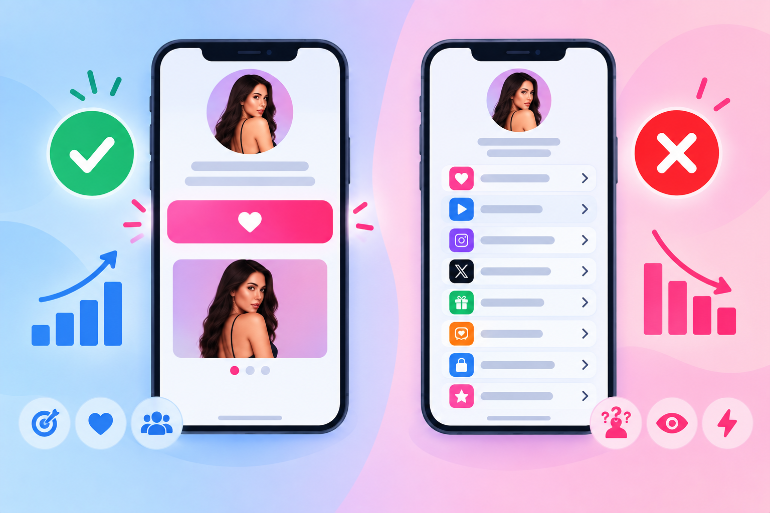
My honest read: three to five links with one dominant button is the sane middle for most creators.
It gives the page a legitimate reason to exist without turning your primary action into one option among many.
What I would not do is treat extra links as a safety guarantee.
One creator asked the sharper question in a community thread: if the platform does not want the redirection at all, what does the extra dressing actually buy you?
That is the right instinct.
Page structure changes how a page reads, not what your destination is.
If your page or domain is already getting flagged, the fix is diagnostic rather than cosmetic, and we cover it in how to check whether your domain is blocked.
How Should You Label the Main Button?
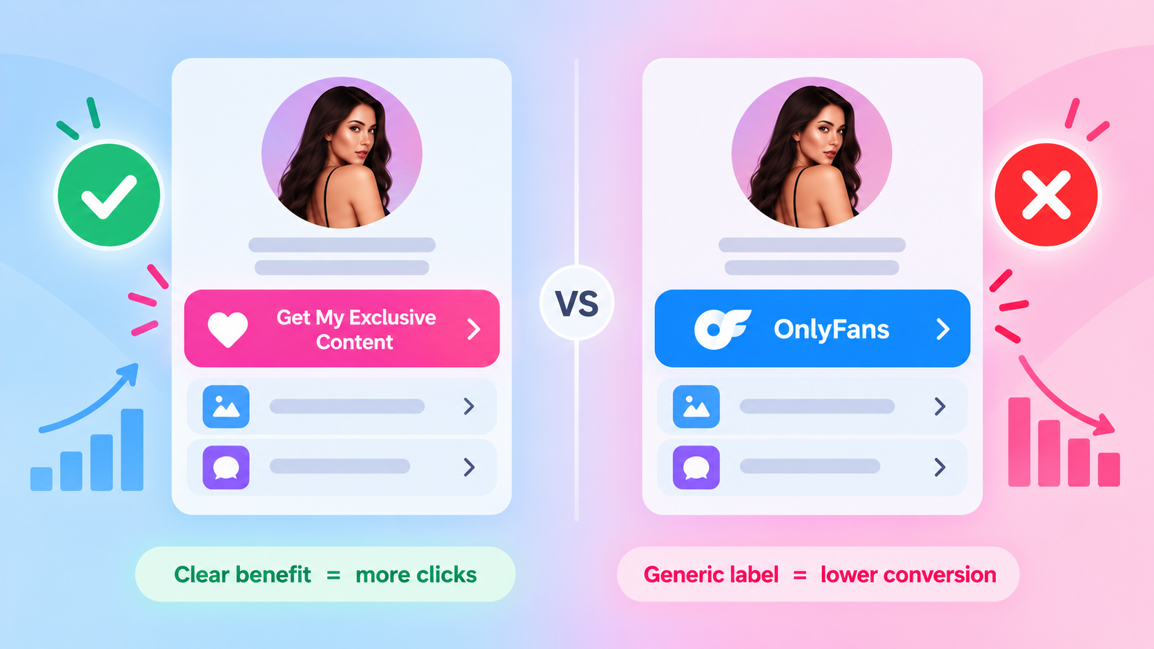
Describe what the visitor gets. Do not name the platform.
A button reading “Exclusive content” outperforms one reading the platform name, because it sets an expectation the paywall then confirms.
- Someone who taps a labelled promise arrives ready.
- Someone who taps a platform name arrives at a payment screen they did not picture.
Wording that works:
- Exclusive content
- See everything
- My private page
- Full album inside
Avoid anything that promises something the destination does not deliver.
Beyond the honesty problem, Meta’s spam policy specifically names misleading links, meaning content that promises one type of content and delivers something substantially different.
Where Should the Age Gate Go?
Use one gate. Two is where the drop-off gets ugly.
An age confirmation and a sensitive-content warning are separate things, and stacking both means a visitor taps through two interruptions before reaching anything.
Creators report the sharpest conversion losses on exactly that three-step path.
How to choose:
- Platform rule or local law requires it. Use it, and pick whichever form the requirement actually names.
- Your own risk tolerance. A single content warning is the lighter of the two.
- Neither applies. Skip it. It only costs you conversions.
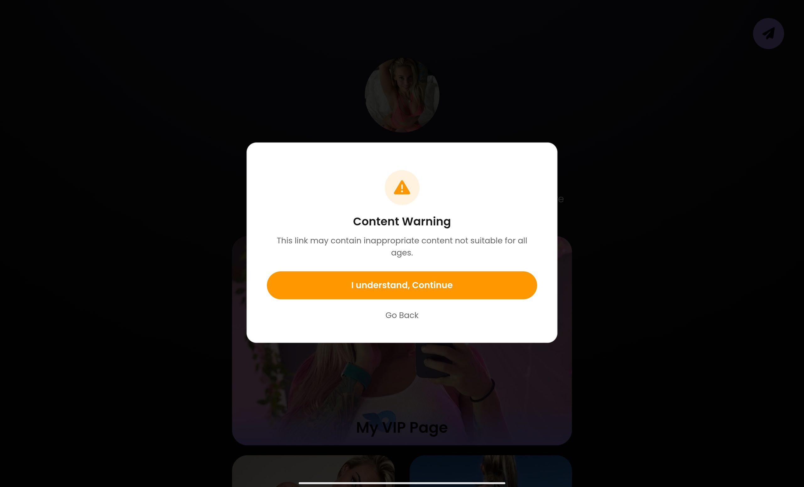
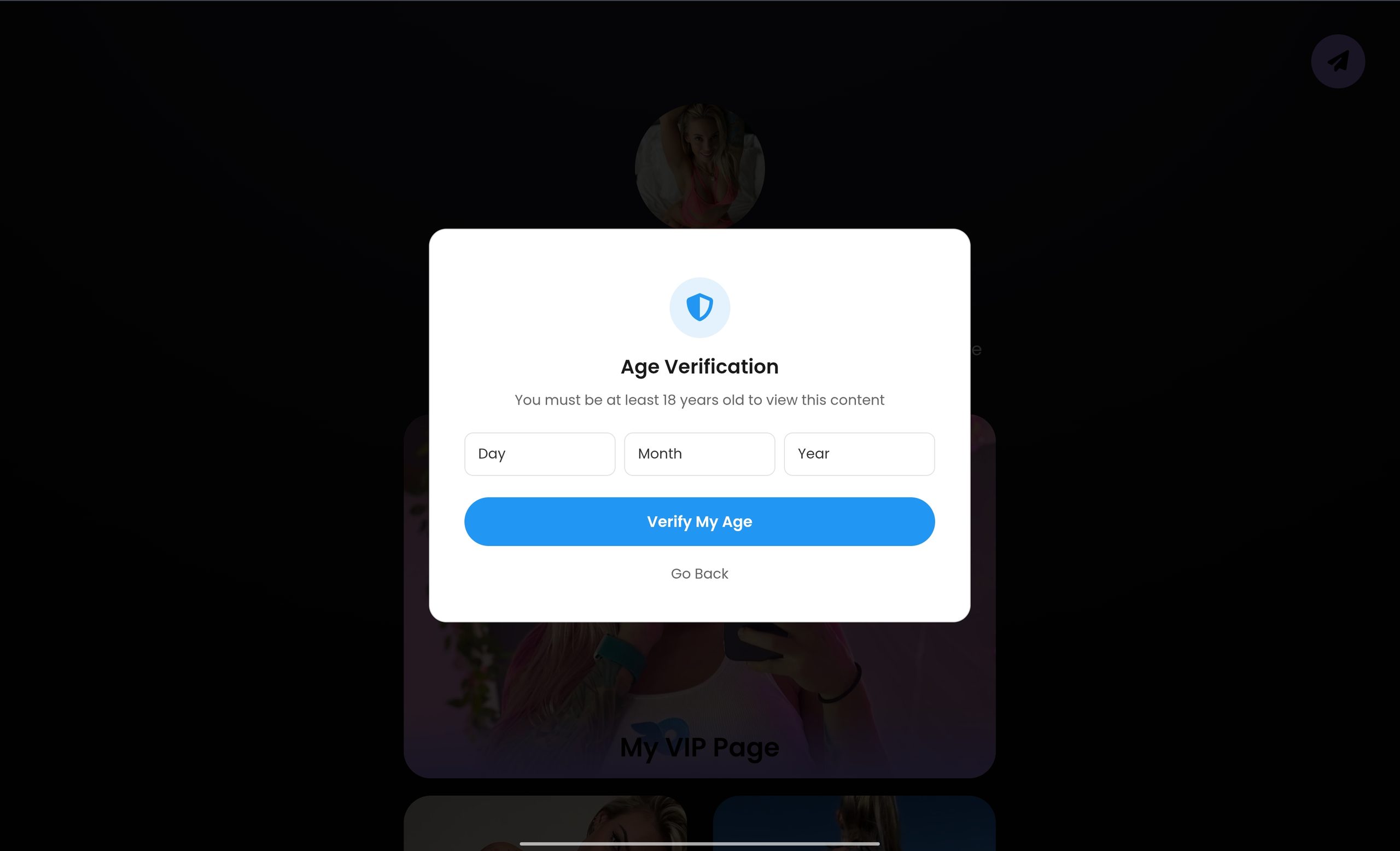
Put the gate on the button rather than the page where you can.
A visitor who has already chosen to tap is more willing to confirm than someone blocked on arrival before seeing anything.
One related setting worth getting right: if your page is opening inside a social app’s built-in browser, logins and payments break at the final step regardless of how good your page is.
Our guide on getting out of in-app browsers covers that fix.
What Should You Remove?
Most underperforming creator pages are not missing anything.
They have too much.
- Long bios. Nobody reads paragraph three.
- Every social account you own. Pick the ones that feed your funnel.
- Duplicate buttons to the same destination. Repetition reads as spam, not emphasis.
- Heavy uncompressed images. Slow pages lose people before they see the button.
- Anything below the fold that outranks your primary action in size or colour.
- Dead links. An expired promo link makes the whole page look abandoned.
A useful test: cover everything except your main button and one line of text.
If the page still communicates the offer, the rest was decoration.
Does the Page Layout Actually Change Conversions?
Yes, though less than the number of choices does.
Creator communities report better results from layouts that show one thing at a time, like a swipeable or slider-style page, than from a long vertical list.
That fits the logic above: a layout that reveals one option at a time is structurally closer to one page, one action.
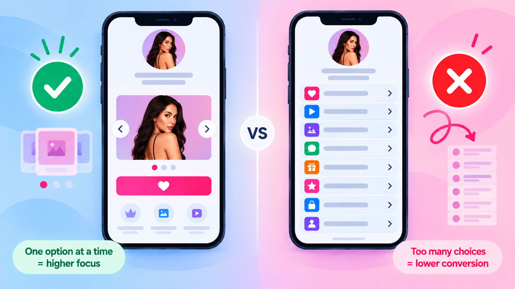
Treat those reports as a hypothesis for your own audience rather than a rule.
Layout preference varies by niche and traffic source, and a slider that suits a warm Telegram audience can confuse cold traffic.
Test one change at a time.
Run one layout for a week, switch, and compare subscribers rather than page views. Comparing two variables at once teaches you nothing.
Why Do Page Visits Not Turn Into Subscribers?
When the page gets traffic but the profile does not, the cause is usually one of five things.
- The button is below the fold on the phone sizes your audience actually uses.
- The page is slow, most often from large images on mobile data.
- Two gates are stacked, creating a three-tap path.
- The promise does not match the destination, so people bail at the paywall.
- Your own bot filter is blocking real visitors, which happens to people on VPNs and public Wi-Fi.
That last one is worth checking first because it is invisible from your side.
The page looks fine when you test it, and only certain followers hit a wall.
Our guide to bot traffic in link analytics explains how to confirm it.
Also separate page problems from measurement problems.
If you cannot yet see how many people reach your profile versus subscribe, set that up first using the method in our OnlyFans link tracker guide.
How Do You Build One Without Styling Every Page by Hand?
This is where creators managing several profiles lose the most time.
One asked it directly in a community thread: is there a way to save the page as a template, instead of customising every single link separately?
The answer is to separate the four things people usually confuse.
| Thing | What it does |
|---|---|
| Template | A reusable starting structure for a new page |
| Theme | Restyles a page that already exists |
| Header layout | Controls how the top of the page is structured |
| Widget | A content block you place on the page |
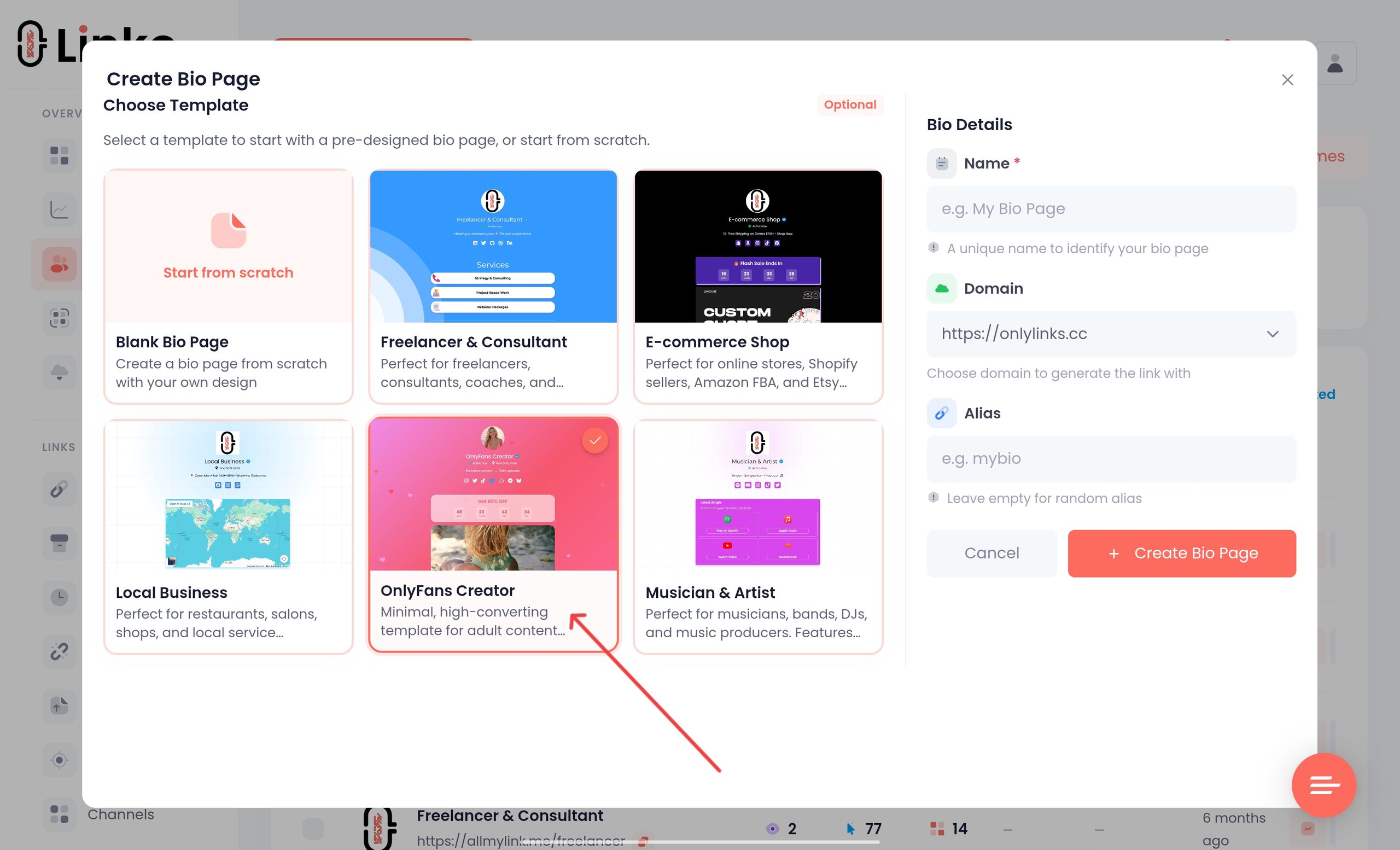
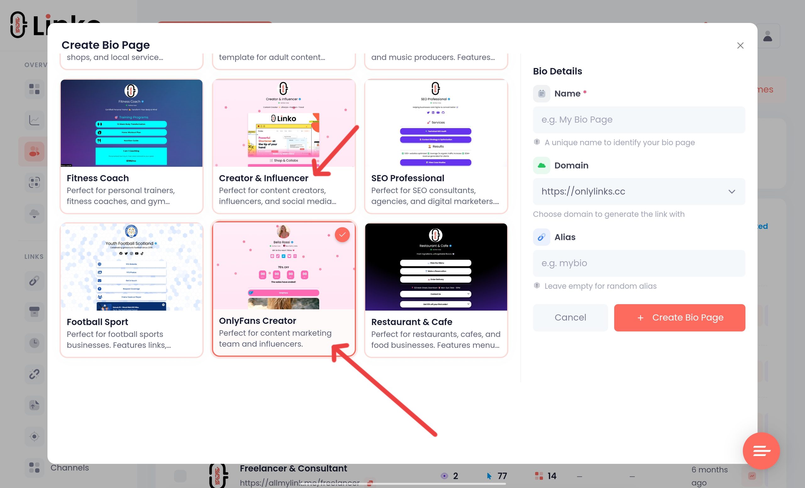
Build one page you are happy with, save it as a custom template, then start every new creator from it and change only the photo, name, and destination.
Styling from scratch each time is the mistake.
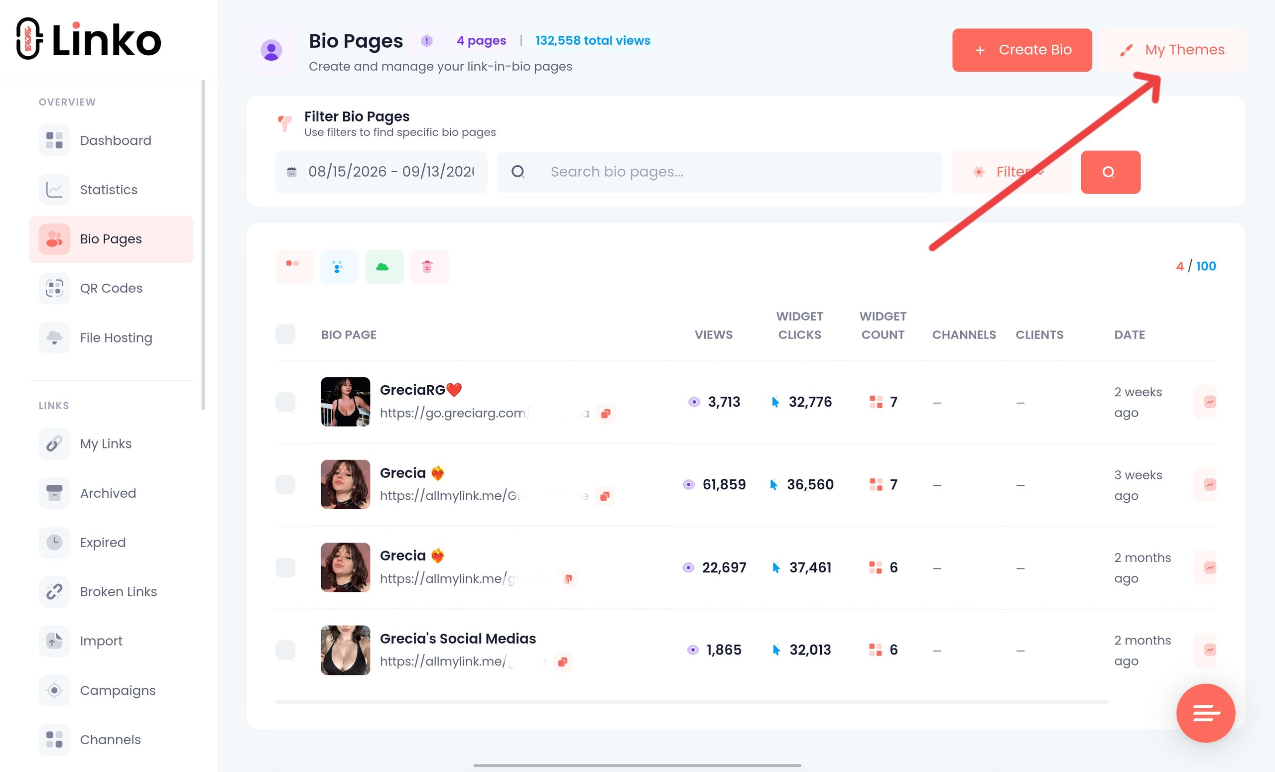
- In Linko the pieces that matter for this are Custom Bio Templates for reuse,
- 35+ themes and 11 animated themes for the design layer,
- 48+ widgets for structure, and
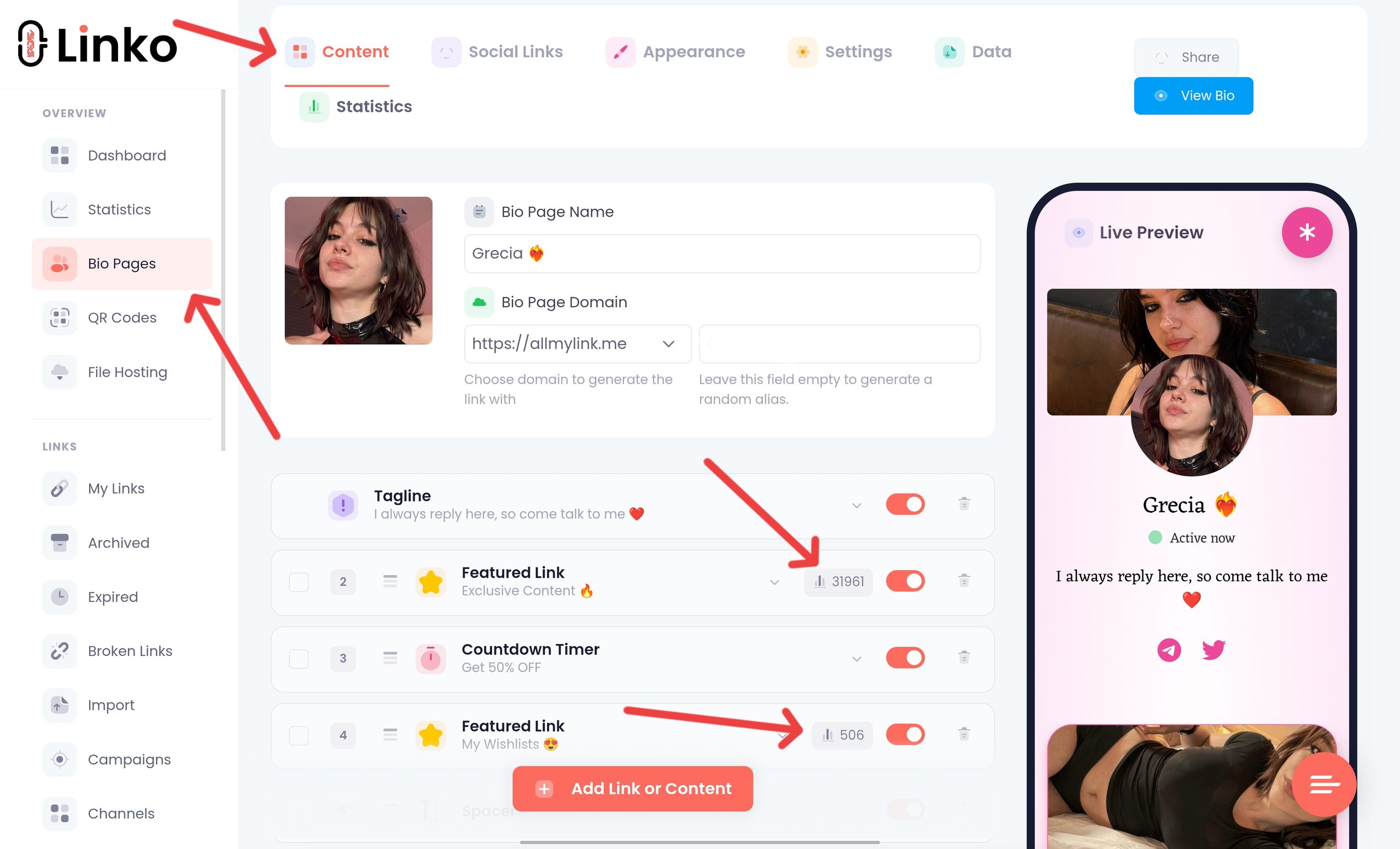
- Per-widget click analytics so you can see which button is actually being tapped rather than guessing.
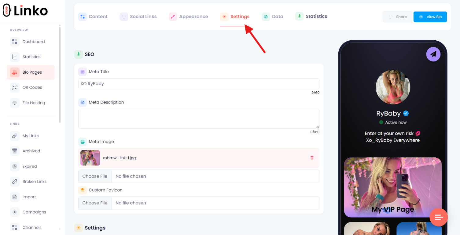
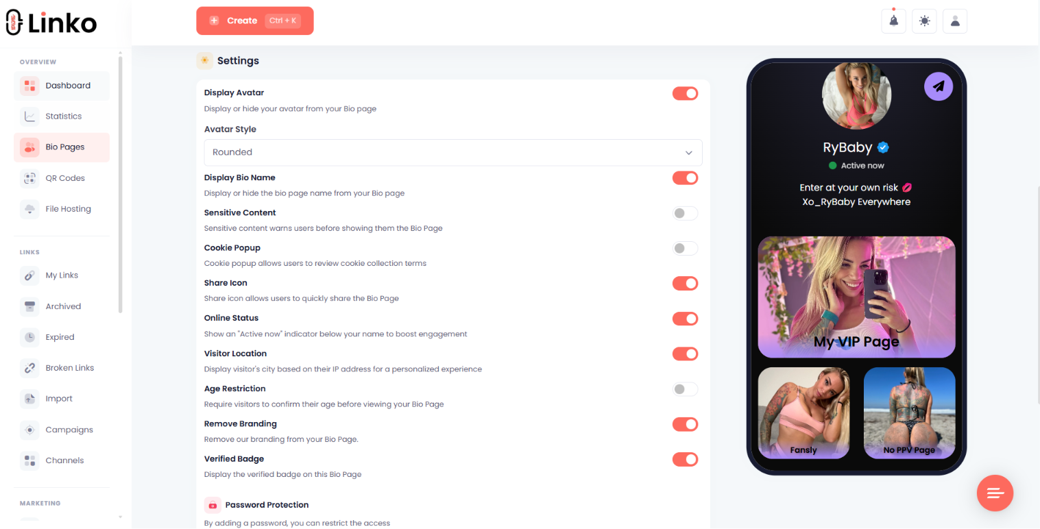
The visitor controls are on every plan, including Free:
- Date-of-birth Age Restriction,
- The sensitive-content warning modal, and
- Per-widget country and language targeting.
Uploaded images are converted to WebP and served from a CDN automatically on every account, which handles the page-speed problem without you compressing anything by hand.
Two limits worth naming.
Custom CSS and Custom JS Code start on Pro plan, and Custom JS Code only runs when the page is viewed on your own connected custom domain, never on a shared Linko domain.
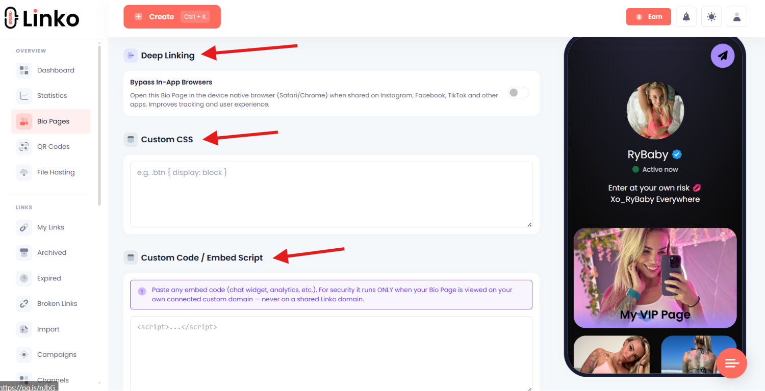
Bio Page Shield Protection starts on Starter plan and, as covered above, can block a small number of real visitors along with the bots.
For the wider structure of a bio page beyond this niche, see our complete guide to link in bio pages, and you can build one on the Bio Pages feature.
Frequently Asked Questions
How many links should be on an OnlyFans landing page?
Three to five, with one clearly dominant button. Fewer converts better, and past five the page turns into a menu that people browse instead of acting on.
Does adding extra links make my page safer?
It changes how the page reads to an automated scan, but it does not change where your link leads, and it measurably costs conversions. Treat it as a trade you are choosing, not as protection you are getting for free.
Should I put an 18+ warning on my page?
Add one if a platform rule, a local law, or your own risk assessment calls for it. Use a single gate rather than stacking an age check and a content warning, since two interruptions is where the sharpest drop-off happens.
What should the main button say?
Describe what the visitor gets, such as “Exclusive content,” rather than naming the platform. The label sets an expectation the paywall then confirms, which is why it converts better than a bare platform name.
Do I need a custom domain for my landing page?
Not to get started, but it helps, because a shared domain carries other people’s reputation alongside yours. Branded domains start on Linko’s Starter plan.
Why does my page get clicks but no subscribers?
Check the button position on a small phone, the page load speed, whether two gates are stacked, and whether your bot filter is blocking real visitors. Those four cover most cases before you start rewriting copy.
Build the Page for One Decision
Every element on a creator page either moves someone toward the button or gives them a reason to wander off.
There is no neutral content. So build for one decision.
One recognisable photo, one line of promise, one dominant button above the fold, a little proof, and the smallest gate your situation genuinely requires.
Then be honest with yourself about the safety trade.
If you add links to dilute the page, you are buying a different kind of risk with conversions, and you should know the price you paid rather than assuming it was free.
Save the version that works as a template, and every page after the first takes minutes instead of an afternoon.
Agencies running this across a roster will find the wider stack covered in our roundup of OnlyFans marketing tools for agencies.
If you just want to build the page, you can start on the free plan and upgrade when you need your own domain.
Comments